The art of the post template
Creating gorgeous post layouts has never been easier in Ghost. Dive into our step-by-step guide to learn everything you need to know about creating a custom post template.
The post template is the heart and soul of a theme. It’s where authors bring their creative content to life, and where readers immerse themselves in these narratives. In this comprehensive tutorial, we'll guide you through each stage of creating a stunning post template. By the end of it, you'll be well-equipped to construct your own unique post templates in Ghost.
Using the post template from the fictional music publication, Of Record, as a guide, we'll delve into:
- The essence of a post template
- Understanding the data available in the post context
- Steps to design a captivating post header
- Bringing in your post content
- Tips and tricks for creating a beautiful reading experience
Are you ready to create the perfect post template with us? Let's get started! To help you better visualize what we're working on, we've included a short video of the post page we're about to create.
Of Record's post template
What's the post template?
The post template, aptly named post.hbs, is responsible for rendering your post content, that is, anything and everything you write in the editor. The template file must be placed in the root of your theme. (If a theme doesn't have a page.hbs template, Ghost will use the post template to render pages, too.)
.
├── LICENSE
├── README.md
├── assets
├── author.hbs
├── default.hbs
├── error-404.hbs
├── error.hbs
├── gulpfile.js
├── index.hbs
├── package.json
├── page.hbs
├── partials
├── post.hbs # The post template
└── tag.hbs
Theme file structure
Accessing post data
The post template opens with two essential bits of Handlebars code.
{!< default}}

{{#post}}
{{!< default}} instructs Ghost to embed the post template into the default layout. If you imagine your webpage as a sandwich, then your default template serves as the slices of bread, while the post template is the filling. For more details, check out our tutorial on the default template.
Moving on to {{#post}}, this command opens the post context, granting you access to post data and helpers. This means you can now tap into crucial data like the post title, feature image, author, and more. As we traverse through Of Record’s post template, we’ll elucidate the data and helpers that are most likely to come in handy. For a comprehensive list of all available data and helpers, visit the post context docs.
Dynamic styling with post_class
Here's the next line of the post template:
<main class="or-post or-container {{post_class}}">There are two key aspects to focus on in this tag:
- Static classes: We use two static classes.
or-postdefines the max width of the post content, andor-containerpads and centers the content. - Dynamic classes with
{{post_class}}: This helper dynamically outputs classes based on the post data. Here's how it works:
- All posts automatically get the
postclass - Featured posts get the
featuredclass - Pages get the
pageclass - Every tag associated with the post provides a class in the format
tag-{slug}.
For the example post, "The Role of Independent Record Stores," which has the "industry" tag, {{post_class}} is rendered as post tag-industry. The screenshot below shows the final output of the post's static and dynamic classes.

These dynamic classes open the door for you to target posts, programmatically changing styles based on a tag or featured status.
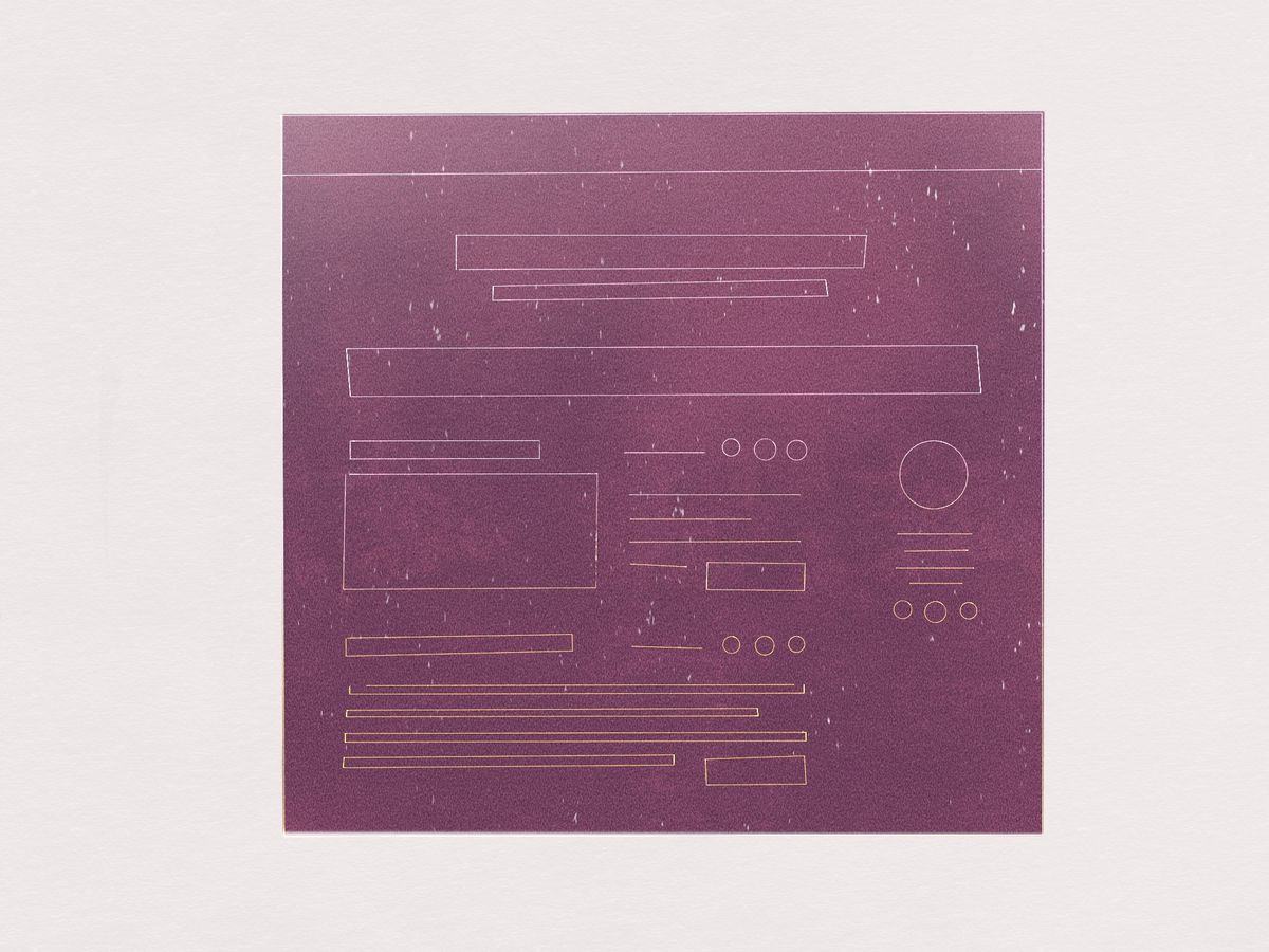
Create the post header
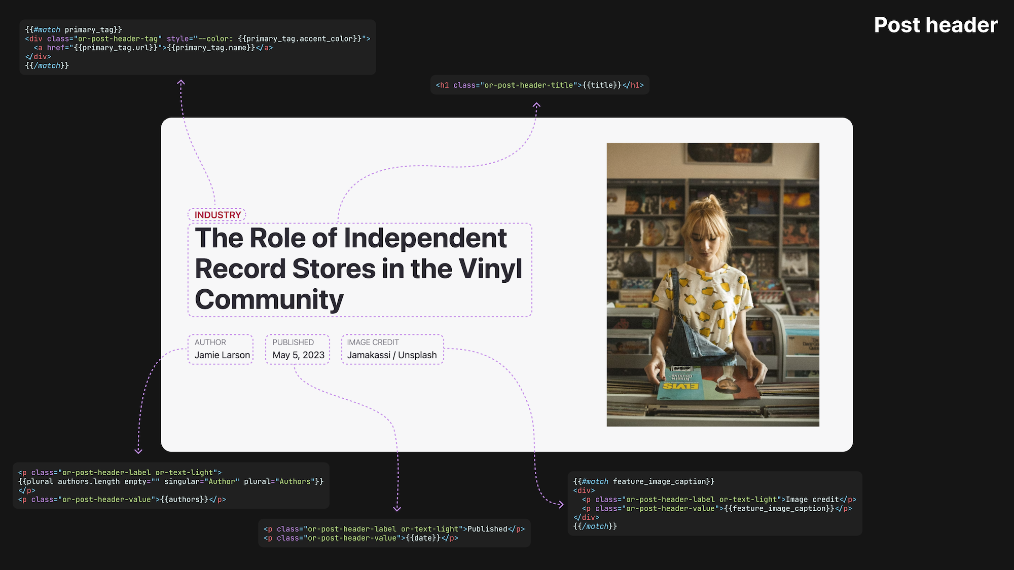
The next part of the template is the post header. It contains all the metadata about your post, including its title, publication date, author(s), tags, feature image, and more.
Above, we've shared a diagram that shows the code underlying each header element. Let's walk through this code to understand it better:
<header class="or-post-header">
    <div class="or-post-header-text">
        {{#match primary_tag}}
            <div class="or-post-header-tag" style="--color: {{primary_tag.accent_color}}">
                <a href="{{primary_tag.url}}">{{primary_tag.name}}</a>
            </div>
        {{/match}}

        <h1 class="or-post-header-title">{{title}}</h1>

        {{#match custom_excerpt}}<p>{{custom_excerpt}}</p>{{/match}}

        {{#is "post"}}
        <div class="or-post-header-meta or-flex">
            <div>
                <p class="or-post-header-label or-text-light">{{plural authors.length empty="" singular="Author" plural="Authors"}}</p>
                <p class="or-post-header-value">{{authors}}</p>
            </div>
            <div>
                <p class="or-post-header-label or-text-light">Published</p>
                <p class="or-post-header-value">{{date}}</p>
            </div>
            {{#match feature_image_caption}}
            <div>
                <p class="or-post-header-label or-text-light">Image credit</p>
                <p class="or-post-header-value">{{feature_image_caption}}</p>
            </div>
            {{/match}}
        </div>
        {{/is}}
    </div>
...
The primary tag
{{#match primary_tag}} Inside the post context, we have access to the primary_tag object, that is, the first tag on a post. The match helper is then employed to check whether a post has a primary tag. If you're unfamiliar with the match helper, think of it as a gatekeeper. It only allows the code within the match tags to run if the post has a primary tag. Otherwise, it instructs the code to skip this block.
When the post has a primary tag, the following code displays the tag's name and provides a link to it:
<div class="or-post-header-tag" style="--color: {{primary_tag.accent_color}}">
    <a href="{{primary_tag.url}}">{{primary_tag.name}}</a>
</div>
There are a few interesting things happening here.
In Ghost Admin, it’s possible to set an accent color for each tag, which is why “Industry” has a red color. By using an inline style tag, we can dynamically define the color with CSS custom properties.
Here's a diagram that walks through the process of how this works:
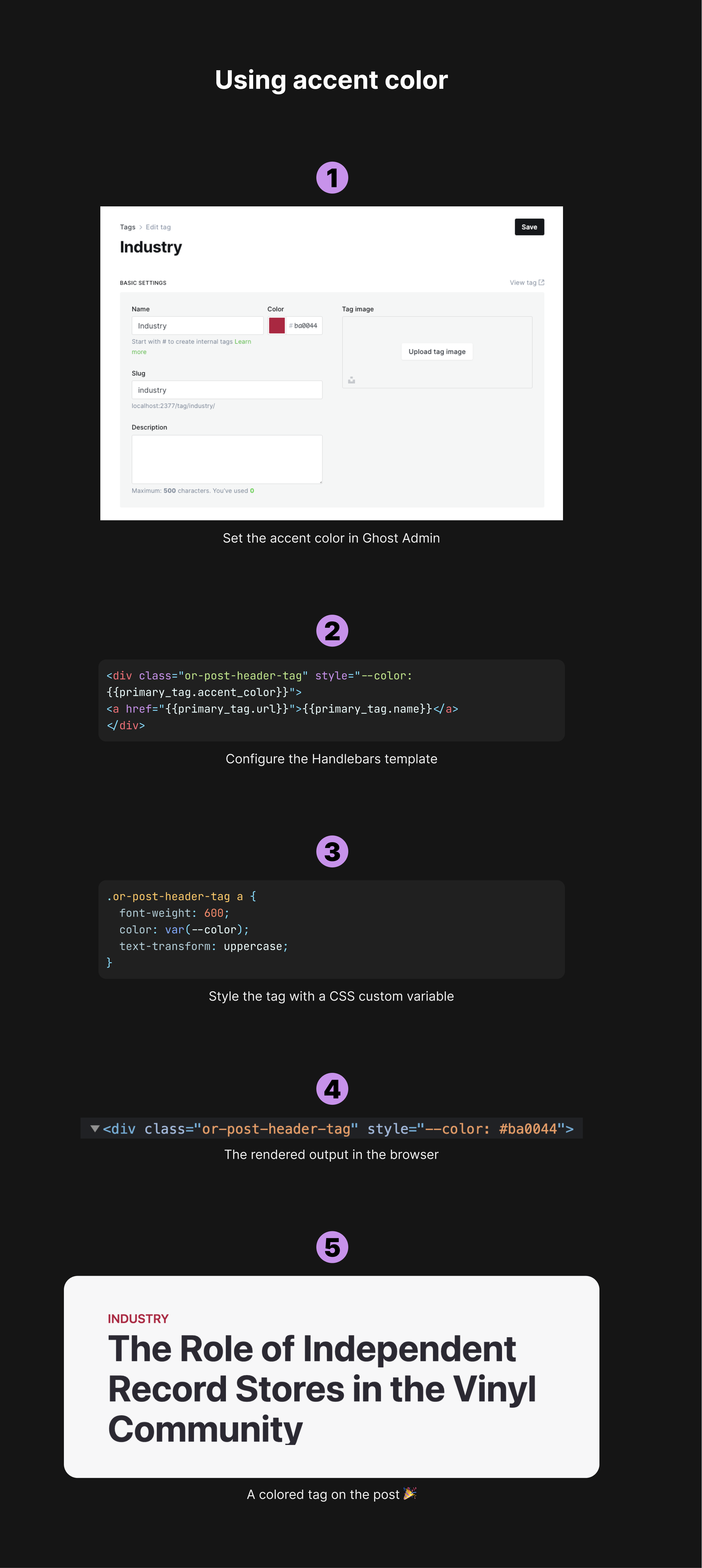
We then create a link to the tag page with an anchor link, setting the href via the primary_tag's URL property.
Finally, we display the tag’s name: {{primary_tag.name}}.
This dynamic feature allows you to draw attention to the main topic of the post, providing readers with a clear understanding of the post's theme at first glance.
Post title
<h1 class="or-post-header-title">{{title}}</h1>The next line of code brings in the post title with the {{title}} helper. This one is about as straightforward as it gets!
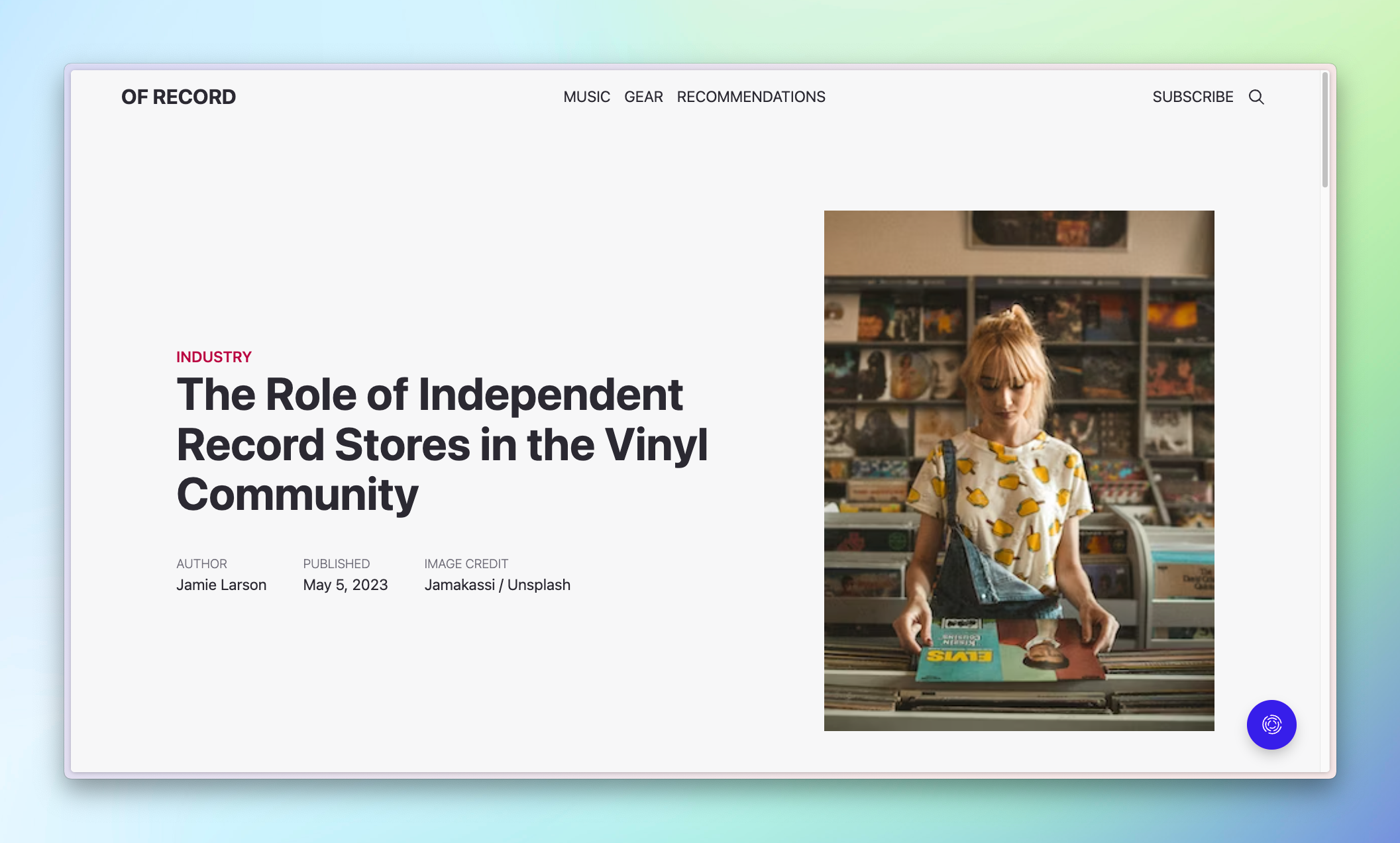
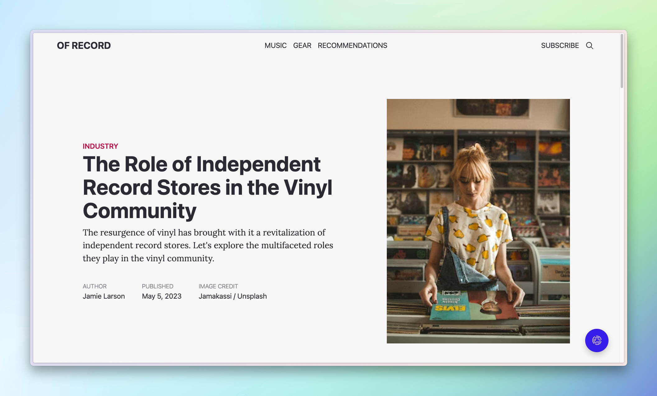
Custom excerpt
{{#match custom_excerpt}}<p>{{custom_excerpt}}</p>{{/match}}The match usage here is identical to the one above: we’re testing for the existence of a custom excerpt, which means an excerpt that’s deliberately set by the author (not automatically generated). If set, we show the custom excerpt. Using the match helper ensures that we don’t have an empty p tag on our rendered page.
Here's our example post with and without a custom excerpt:
Working with post metadata
Adding rich, relevant metadata to your posts can greatly enhance your site's SEO and make your content more discoverable. Thankfully, Ghost provides a convenient way to include post metadata, which encompasses elements such as authors, publication date, and the caption for the featured image.
Let's break down each element:
Authors
<div>
    <p class="or-post-header-label or-text-light">{{plural authors.length empty="" singular="Author" plural="Authors"}}</p>
    <p class="or-post-header-value">{{authors}}</p>
</div>
The metadata element follows a basic structure: a label on top and the value beneath it. For authors, we leverage two handy Handlebars helpers: plural and authors.
The plural helper smartly adjusts the label text based on the number of items (or authors, in this case). When there's just one author, it reads "Author," but for multiple authors, it changes to "Authors."
The authors helper, on the other hand, generates a comma-separated list of authors, each linking to their respective profile pages. This is a great way to acknowledge authors and make it easy for readers to explore more of their work.
Publication date
<div>
    <p class="or-post-header-label or-text-light">Published</p>
    <p class="or-post-header-value">{{date}}</p>
</div>
Next up, we show the publication date with the {{date}} helper. While this helper may seem simple, there’s a lot of power under the hood. Not only can you format the date however you want, but Ghost will also default to outputting the date based on the language you enter in General settings.
The screenshot below shows how the date format changes based on the language set in Ghost Admin.
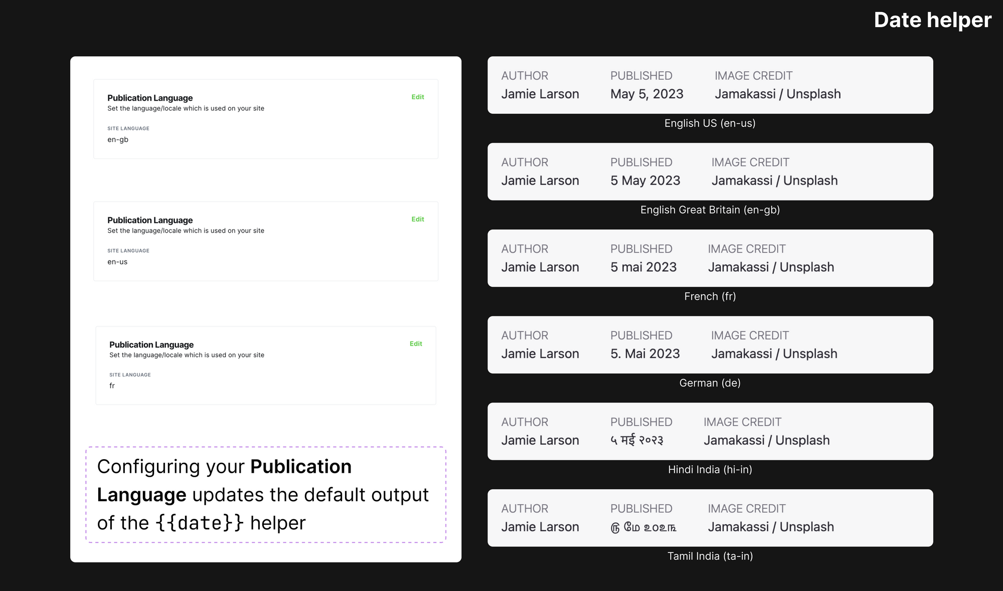
Image credit
{{#match feature_image_caption}}
    <div>
        <p class="or-post-header-label or-text-light">Image credit</p>
        <p class="or-post-header-value">{{feature_image_caption}}</p>
    </div>
{{/match}}
Our last bit of metadata is the image credit or caption for the feature image. We use the match helper to check whether this value has been set. If so, we display it.
Feel free to experiment with these helpers and see how you can customize them to suit your site's style and requirements.
Picture perfect with a feature image
The feature image is the first visual your reader encounters, setting the tone for the rest of your post. Let's see how we handle this critical component in Ghost.
{{#match feature_image}}
    <div class="or-post-header-image">
        <picture class="">
            <source
            srcset="
            {{img_url feature_image size="xxs" format="avif"}} 30w,
            {{img_url feature_image size="xs" format="avif"}} 100w,
            {{img_url feature_image size="s" format="avif"}} 300w,
            {{img_url feature_image size="m" format="avif"}} 600w,
            {{img_url feature_image size="l" format="avif"}} 1200w,
            {{img_url feature_image size="xl" format="avif"}} 2000w"
            sizes="(max-width: 350px) 300px, (max-width: 700px) 600px, (max-width: 800px) 1200px, (max-width: 1200px) 300px, 600px"
            type="image/avif"
            >
            <source
            srcset="
            {{img_url feature_image size="xxs" format="webp"}} 30w,
            {{img_url feature_image size="xs" format="webp"}} 100w,
            {{img_url feature_image size="s" format="webp"}} 300w,
            {{img_url feature_image size="m" format="webp"}} 600w,
            {{img_url feature_image size="l" format="webp"}} 1200w,
            {{img_url feature_image size="xl" format="webp"}} 2000w"
            sizes="(max-width: 350px) 300px, (max-width: 700px) 600px, (max-width: 800px) 1200px, (max-width: 1200px) 300px, 600px"
            type="image/webp"
            >
            <img
            srcset="
            {{img_url feature_image size="xxs"}} 30w,
            {{img_url feature_image size="xs"}} 100w,
            {{img_url feature_image size="s"}} 300w,
            {{img_url feature_image size="m"}} 600w,
            {{img_url feature_image size="l"}} 1200w,
            {{img_url feature_image size="xl"}} 2000w"
            sizes="(max-width: 350px) 300px, (max-width: 700px) 600px, (max-width: 800px) 1200px, (max-width: 1200px) 300px, 600px"
            src="{{img_url feature_image size="xxs"}}"
            alt="{{#match feature_image_alt}}{{feature_image_alt}}{{else}}{{title}}{{/match}}"
            >
        </picture>
    </div>
{{/match}}
Once more, we make use of the match helper to check if a feature image is set. Without one, this entire block of code is simply skipped. But, if there's an image ready to shine, we employ Ghost's img_url helper.
What's brilliant about the img_url helper is that it automatically constructs optimized, responsive images. This ensures that no matter what device a user is on, they'll receive the appropriately sized image — be it for a smartwatch or a high-definition 4K monitor.
Images can significantly contribute to the load time of a webpage, but this optimization strategy ensures your Ghost site remains blazingly fast 🏎️
If the concept of responsive images sounds a bit daunting, don't worry — it's a complex topic! You can delve into how the picture tag works and the benefits it offers. Our documentation also provides valuable insights on implementing responsive images in Ghost and utilizing the img_url helper.
And if you're looking for a shortcut, Ghost's VS Code extension is your best friend. It can automatically generate this responsive image code for you ✨
Presenting your content
When it comes to your publication, the main content is the star of the show. But it's the side features that complete the experience, providing context, navigation, and engagement opportunities. So let's dive into how we structure the content and these additional components in Ghost.
The diagram below lays out the post content and sidebar, showing the code behind these elements.
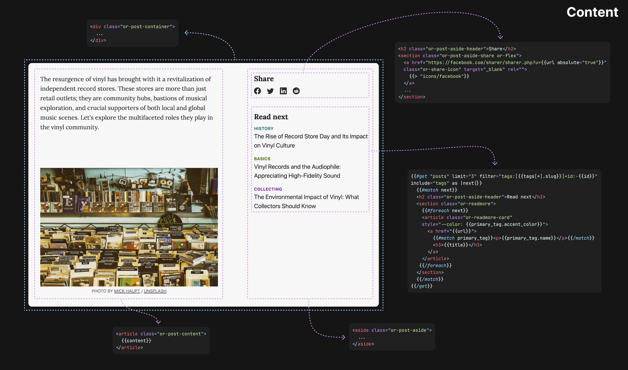
We start with the primary content:
<article class="or-post-content">
    {{content}}
</article>
To help lay out our content, we wrap it in an article tag. Next, the magic of the content helper comes into play. It brings in all the content written in the editor, including text, images, cards, and more.
But a great post isn't only about the main text. Let's turn our attention to the aside section that houses additional features: a table of contents placeholder, share buttons, and a read-next section.
Sidebar
<aside class="or-post-aside">
    <!-- Content for table of contents, share buttons, and read-next section -->
</aside>
This aside tag introduces a sidebar of handy features. Here you can integrate a table of contents for easy navigation, share buttons for spreading the word on social media, and a read-next section to keep your audience hooked with more content.
But you might be wondering how to get these features up and running on your template. Well, you're in luck! We have comprehensive tutorials to guide you:
There's also a full download of the post template file at the end of this post.
We don’t have a tutorial on adding share buttons to your template yet. Let us know if you’d like to see it!
How to enable comments
One of the keys to a lively website is engagement and nothing does that better than a robust comments section. This part of your site allows your readers to share their thoughts, engage with other readers, and even provide valuable feedback.
Now, let's take a look at how to incorporate this crucial component into your Ghost site:
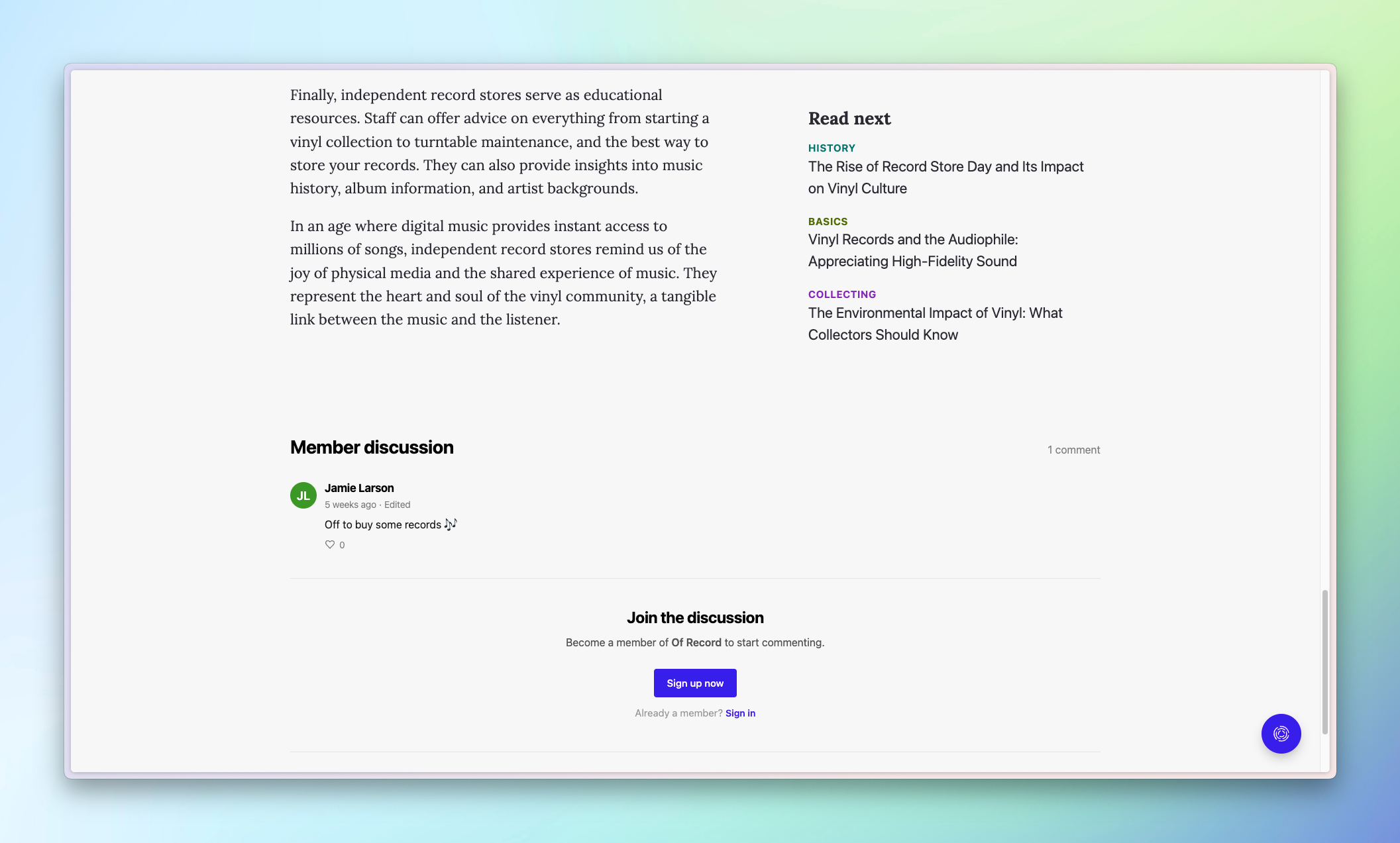
{{comments}}The simplicity of the comments helper belies its impact. When comments are enabled, this helper outputs the comments user interface (UI) onto your site. What's more, you have the ability to customize certain aspects of the UI to better fit your site's look and feel.
For a deeper dive into the options available to you, check out our docs, which provide extensive guidance on how to customize the comments section.
As a final note, remember to close your post block with the {{/post}} helper. This marks the end of your post and ensures all your code stays neatly organized.
And that's it! You've got a fully-featured Ghost template ready for your posts. Here's the full template for reference and available for download.
Summary
Whew! That's a lot of ground we covered, from understanding the basic structure of the post template to diving into the post context, Handlebars helpers, and the nuances of setting tags and authors. We've looked at how to display post metadata, optimize feature images, and even tackled some advanced aspects, like custom excerpts and adding an aside section for share buttons and a read-next feature. And, of course, we've explored the important task of fostering engagement through a comments section.
The next step is yours. Take what you've learned here and put it into practice. Experiment with the different helpers and design elements to realize your vision. Ghost is a powerful and flexible platform that can help your content really sing.
And remember, you're not alone! If you have questions, need help, or simply want to share the dope Ghost theme you created, come join us on the official Ghost Forum. It's a lively and supportive community full of people who are passionate about Ghost and eager to help each other out. We look forward to seeing you there!