Custom settings are the ultimate power-up for themes
Want to elevate your Ghost theme? Dive into custom settings with this complete guide. Choose typefaces, color schemes, and more. Your theme, your rules!
Custom settings are perfect for developers building themes because users can tailor their theme to match their publication without having to touch a line of code. Even if you’re building a theme for yourself, custom settings give you instant control over aspects like typeface, layout, colors, and much more. The following guide will walk you through everything you need to know to make the most of custom settings in your Ghost theme.
An overview of custom settings
Use custom settings to create different possibilities for your theme — possibilities that users can configure right from Ghost Admin. For example, let users choose the tone for their publication by giving the option to have a refined serif typeface or a modern sans serif one.
While we’ll go into the details below, here are the essential points to know about custom settings:
- Define custom settings in your theme’s
package.jsonfile - Access the values with the
@customhelper - You can have up to 20 custom settings
How to configure custom settings
Set up custom settings in the theme’s package.json file, under the config.custom key. Add each setting as a new key, using snake_case. Here’s an example of a custom setting called “typography”:
{
    "config": {
        "custom": {
            "typography": {
                "type": "select",
                "options": ["Modern sans-serif", "Elegant serif"],
                "default": "Modern sans-serif",
  			    "description": "Define your site's typography"
            }
        }
    }
}
The most important option to set for each setting is its type because it determines which other keys are required.
Understanding types
There are five possible types. Let's look at each in detail.
Select
As seen in the example, the select type presents the user with a dropdown of options you define in the required options key. A default key is also required. It must contain a value that matches one of the defined options.
Boolean
The boolean type presents the user with a true/false toggle. When using the boolean type, you must also specify a default value (true or false).
Color
The color type presents the user with a color picker. A default hex color must be provided when using this type.
@site.accent_color helper.Image
The image type presents the user with an image uploader. The output from this type is either an image URL or a blank string. The image type works great with the img_url helper, which allows you to optimize the uploaded image automatically!
Text
The text type presents the user with a text input. The default value is optional, meaning that it’s possible for the output of this type to be empty.
Find a full overview of these types in the docs.
Add descriptions to share the purpose of custom settings
For each type, it's possible to add an optional description. The value provided for this key appears in Ghost Admin with the custom setting. It's a great way to communicate to users what the custom setting is for.
By giving the setting a name, description, type, and any additional required keys, you've defined a custom setting. Oh, yeah! Let's see how to access its user-defined value in the theme.
Access custom settings within the theme
Gain access to the user-defined value with the @custom helper plus the setting name. To access the typography setting above, use @custom.typeface anywhere in the theme.
To then change the typeface for the theme, use the custom setting to modify the CSS class on the body tag in default.hbs.
<body class="{{#match @custom.typeface "Modern sans-serif"}} has-sans-serif-font{{else}} has-serif-font{{/match}}</body>
Use the match helper
We use the match helper above to test the value of the custom setting. Specifically, we’re testing whether the typeface value equals “Modern sans-serif.” (When using the match helper to test equality, the = sign can be omitted.) It’s also possible to test other conditions by using different operators: !=, <, >, >=, and <=. If the custom setting equals "Modern sans-serif," then the has-sans-serif-font class is output. Otherwise, has-serif-font is output.
The only other required action on your part is to include the classes in your CSS:
.has-sans-serif-font {
  font-family: -apple-system, BlinkMacSystemFont, avenir next, avenir, segoe ui, helvetica neue, helvetica, Cantarell, Ubuntu, roboto, noto, arial, sans-serif;
}

.has-serif-font {
  font-family: Iowan Old Style, Apple Garamond, Baskerville, Times New Roman, Droid Serif, Times, Source Serif Pro, serif, Apple Color Emoji, Segoe UI Emoji, Segoe UI Symbol;;
}
Now, the user can set their desired typeface right from Ghost Admin (and change it any time if they’re so inclined) 🔠
package.json file. Use our official VS Code extension to autocomplete your custom settings. When in a Handlebars file, type custom, and the extension will autocomplete the property with your settings, even adding the @ sign.Grouping custom settings
There’s one last bit of configuration possible for custom settings: groups. By default, all custom settings are put in the Site-wide group, meaning that the setting is applicable across the whole publication.
However, specific groups exist for settings that only apply to the homepage or post pages. For example, with Casper, it’s possible to specify three different layouts on the homepage. Here’s how that option is defined in package.json and its group defined:
"feed_layout": {
    "type": "select",
    "options": [
        "Classic",
        "Grid",
        "List"
    ],
    "default": "Classic",
    "group": "homepage"
}
For settings applicable to post pages, set the group to post.
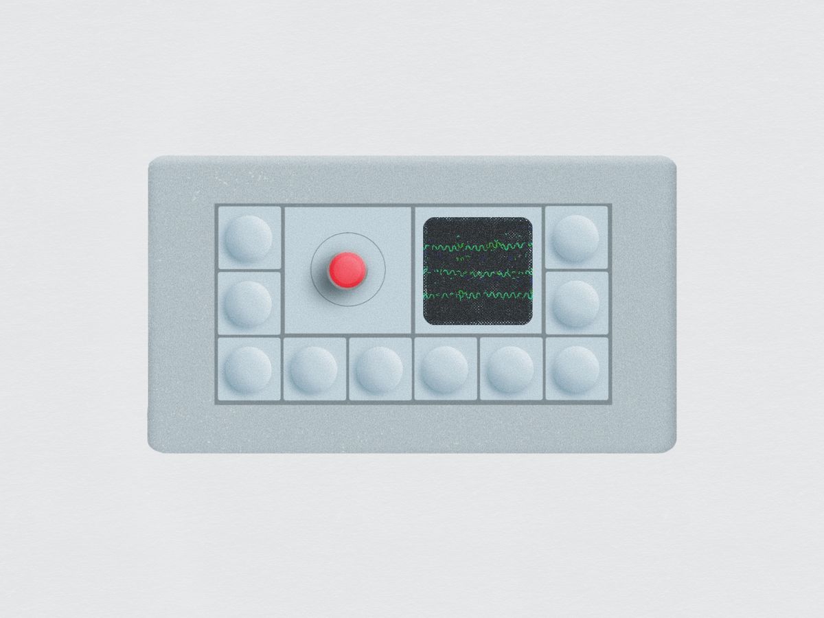
And that’s everything you need to know about custom settings. Here’s a visual to help bring it all together.

Custom settings in the wild
Eager for a few more examples? Let's check out two different ways custom settings are used in Ghost’s default theme, Casper.
Dynamic color scheme
Imagine giving your users the power to switch between light and dark modes, or even automate the color scheme based on OS preferences. Casper does just that!
"color_scheme": {
    "type": "select",
    "options": [
        "Light",
        "Dark",
        "Auto"
    ],
    "default": "Light"
}
The color_scheme custom setting allows users to choose whether they want their site to display in light, dark, or auto mode.


The custom setting is accessed in default.hbs on the html tag:
<html lang="{{@site.locale}}"{{#match @custom.color_scheme "Dark"}} class="dark-mode"{{else match @custom.color_scheme "Auto"}} class="auto-color"{{/match}}>
When the color scheme is set to “Dark,” the dark-mode class is added to the element (and auto-color is added when that option is chosen). Then, in the theme’s CSS, styles are added with classes to reflect these choices. For example, here’s the rule that sets the background to a dark color and the text to a light color:
html.dark-mode body {
    color: rgba(255, 255, 255, 0.75);
    background: var(--color-darkmode);
}
The takeaway? You can dynamically add and remove CSS classes based on user preferences, creating multiple styles within a single theme.
Personalize the sign-up call to action
Custom text for the sign-up CTA (call to action) on Casper’s post page makes the experience more engaging. Here's the setting:
"email_signup_text": {
    "type": "text",
    "default": "Sign up for more like this.",
    "group": "post"
},
Key insights:
- Fallback text: If the user doesn’t provide their own, a default is provided to ensure the CTA text isn’t blank.
- Group definition: This setting shows up under the "post" dropdown, making it specific to post pages.
The screenshots below show how this setting appears in Ghost Admin and the default and personalized call-to-actions on the post.


These examples illustrate a few of the many possibilities offered by custom settings. Dive in and explore these features and other custom settings in Casper. Learning from official Ghost themes is a fantastic way to level up your theme-building skills 💪
Summary
With custom settings, you can hand the creative reins to your users, allowing them to make your theme their own. Through this guide, you've learned how to define, access, and leverage various types of custom settings, seen practical examples, and grasped precisely how these settings can transform a user's interaction with your theme.
But your adventure is just beginning.
Visit our official Forum to see what other developers are up to or subscribe to our Build with Ghost Newsletter, the best way to keep up with changes in Ghost and find inspiration for your next gorgeous theme.