A complete guide to partials
Learn partials in Ghost for better code maintenance and consistency. This tutorial will teach you what a partial is, how it's used, and some advanced tips and tricks.
Imagine creating an eye-catching card for your homepage posts, only to realize you need the same card in your post’s read-more section. Copy, paste, and repeat, right? Not so fast! Any change to the card means updating it everywhere you used it—a repetitive and error-prone task.
Enter partials: the solution to your copy-paste woes.
Partials are a helper for reusing chunks of code across your Ghost theme. In this tutorial, we’ll spill the beans on everything you need to know about partials by looking at an example from the fictional publication Of Record. By the end of this tutorial, you’ll know:
- What a partial is and how to use it
- Advanced options with props
- Tips and tricks for excelling with partials
Let’s go 👟
What’s a partial?
A partial is a Handlebars helper for reusing chunks of a template. Think of “partial” as being short for “partial template”—a partial can’t stand alone like a post or index template but is intended to be used as a component of those templates.

Many theme devs find partials helpful in two situations. First, they’re great for any repeating element like a card or CTA, especially when used in multiple templates. You get a single source of truth for the component that doesn’t need to be kept in sync!
Second, partials are useful for splitting out complex elements (like a header) into more manageable components. Instead of a template file with a 100 lines of code, using a partial can cut the file in half and make it easier to work with.
Common use cases for partials include (but aren’t limited to):
Whenever you ever find yourself copying and pasting a lot or seeing a file become long and messy, a partial is likely the perfect solution.
How to use a partial
We covered what a partial is and some common use cases. But how do we use it?
Partials are individual Handlebars files. The file's name is up to you. For a card partial, you can be creative and call it card.hbs. Crucially, however, all your partials need to be in a folder called partials that’s at the root of your theme.
Here is the folder structure for Casper with the partials folder at the top level.
.
├── LICENSE
├── README.md
├── assets
├── author.hbs
├── default.hbs
├── error-404.hbs
├── error.hbs
├── gulpfile.js
├── index.hbs
├── package.json
├── page.hbs
├── partials
├── post.hbs
└── tag.hbs
And, here are the contents of that partials folder:
partials
├── icons
│   ├── avatar.hbs
│   ├── facebook.hbs
│   ├── fire.hbs
│   ├── loader.hbs
│   ├── lock.hbs
│   ├── rss.hbs
│   ├── search.hbs
│   └── twitter.hbs
└── post-card.hbs
Once you’ve created your partial, it’s time to bring it into your template. Use Handlebars curly brackets with a right angle bracket and the partial name. Or, more simply, like this:
{{> "partial-name"}}For example, referencing the partials folder from Casper above, here’s how to bring in the search icon:
{{> "icons/search"}}
Wherever you add this bit of code, Ghost will render the SVG search icon.
With the fundamentals under our belt, let’s walk through a partial from Of Record, a publication that focuses on vinyl records.
Create a post card with a partial


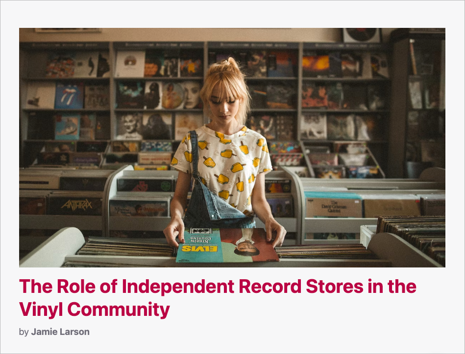
In the screenshots above, you can see a grid of cards from the publication’s homepage and an individual card in isolation. (See our tutorial on creating an index template for more info about the post loop.)
Here’s the entire code for the partial card:
<article class="or-post-card {{classes}}" style="--accent: {{primary_tag.accent_color}}">
    {{#if feature_image}}
    <a href="{{url}}">
        <picture class="or-post-card-image">
            <source
                srcset="
                {{img_url feature_image size="xxs" format="avif"}} 30w,
                {{img_url feature_image size="xs" format="avif"}} 100w,
                {{img_url feature_image size="s" format="avif"}} 300w,
                {{img_url feature_image size="m" format="avif"}} 600w,
                {{img_url feature_image size="l" format="avif"}} 1200w,
                {{img_url feature_image size="xl" format="avif"}} 2000w"
                sizes="(min-width: 1200px) 1200px, 100vw"
                type="image/avif"
            >
            <source
                srcset="
                {{img_url feature_image size="xxs" format="webp"}} 30w,
                {{img_url feature_image size="xs" format="webp"}} 100w,
                {{img_url feature_image size="s" format="webp"}} 300w,
                {{img_url feature_image size="m" format="webp"}} 600w,
                {{img_url feature_image size="l" format="webp"}} 1200w,
                {{img_url feature_image size="xl" format="webp"}} 2000w"
                sizes="(min-width: 1200px) 1200px, 100vw"
                type="image/webp"
            >
            <img
                srcset="
                {{img_url feature_image size="xxs"}} 30w,
                {{img_url feature_image size="xs"}} 100w,
                {{img_url feature_image size="s"}} 300w,
                {{img_url feature_image size="m"}} 600w,
                {{img_url feature_image size="l"}} 1200w,
                {{img_url feature_image size="xl"}} 2000w"
                sizes="(min-width: 1200px) 1200px, 100vw"
                src="{{img_url feature_image size="l"}}"
                alt="{{#if feature_image_alt}}{{feature_image_alt}}{{else}}{{title}}{{/if}}"
            >
        </picture>
    </a>
    {{else}}
    <div class="or-post-card-image or-post-card-image-placeholder">
        <p>{{excerpt}}</p>
    </div>
    {{/if}}

    <div class="or-post-card-content">
        <h2><a href="{{url}}">{{title}}</a></h2>
        <footer class="or-post-card-footer or-text-light">
            <p class="or-text-light">by <strong>{{authors}}</strong></p>
            {{comment_count}}
        </footer>
    </div>
</article>
There’s a lot there, so let’s walk through it line by line.
Using partials with custom properties
<article class="or-post-card {{classes}}" style="--accent: {{primary_tag.accent_color}}">The card partial opens with an HTML article tag. We include a CSS class to help with styling, but you may have noticed that some Handlebars syntax has snuck into our class name: {{classes}}.
classes refers to a custom property that’s defined on the partial. It’s a way for you to pass additional data to the partial wherever it’s invoked in your theme. In Of Record’s home template, we emphasize certain cards by adding the or-large-text class, which increases the size of the title.
Here’s what that looks like in the home template:
{{! In home.hbs, for a section of posts we want to emphasize }}
{{#foreach posts}}
  {{> "card" classes="or-large-text"}}
{{/foreach}}
The classes property is then available to use within the partial file. When the property is included, it’s added to the class list. Otherwise, the class list only includes or-post-card.
{{> "card" class="or-large-text"}}

{{! outputs }}
<article class="or-post-card or-large-text">
...
</article>
{{> "card"}}

{{! outputs }}
<article class="or-post-card">
...
</article>
We also include a style attribute on the article element.
style="--accent: {{primary_tag.accent_color}}"
By defining the CSS custom property --accent via the style attribute, we can dynamically change the color of the title text on hover. {{primary_tag.accent_color}} is a value available on the tag object that provides a hex color defined in Ghost Admin. That’s the reason for the red color in the screenshot above.
Putting this all together, the partial is rendered as follows:
<article class="or-post-card" style="--accent: #349234">...</article>
Let’s now move on to the card image.
Constructing the card image
{{#if feature_image}}
<a href="{{url}}">
    <picture class="or-post-card-image">
        <source
            srcset="
            {{img_url feature_image size="xxs" format="avif"}} 30w,
            {{img_url feature_image size="xs" format="avif"}} 100w,
            {{img_url feature_image size="s" format="avif"}} 300w,
            {{img_url feature_image size="m" format="avif"}} 600w,
            {{img_url feature_image size="l" format="avif"}} 1200w,
            {{img_url feature_image size="xl" format="avif"}} 2000w"
            sizes="(min-width: 1200px) 1200px, 100vw"
            type="image/avif"
        >
        <source
            srcset="
            {{img_url feature_image size="xxs" format="webp"}} 30w,
            {{img_url feature_image size="xs" format="webp"}} 100w,
            {{img_url feature_image size="s" format="webp"}} 300w,
            {{img_url feature_image size="m" format="webp"}} 600w,
            {{img_url feature_image size="l" format="webp"}} 1200w,
            {{img_url feature_image size="xl" format="webp"}} 2000w"
            sizes="(min-width: 1200px) 1200px, 100vw"
            type="image/webp"
        >
        <img
            srcset="
            {{img_url feature_image size="xxs"}} 30w,
            {{img_url feature_image size="xs"}} 100w,
            {{img_url feature_image size="s"}} 300w,
            {{img_url feature_image size="m"}} 600w,
            {{img_url feature_image size="l"}} 1200w,
            {{img_url feature_image size="xl"}} 2000w"
            sizes="(min-width: 1200px) 1200px, 100vw"
            src="{{img_url feature_image size="l"}}"
            alt="{{#if feature_image_alt}}{{feature_image_alt}}{{else}}{{title}}{{/if}}"
        >
    </picture>
</a>
{{else}}
<div class="or-post-card-image or-post-card-image-placeholder">
    <p>{{excerpt}}</p>
</div>
{{/if}}
This part of the card begins with a test: does the post in question have a feature image? In the code, we use the Handlebars if helper. This helper tests whether a value exists or is true. If so, then the image code is rendered. Otherwise, the card shows a post excerpt. This ensures that the card always looks great, no matter the situation 💅
In the screenshot below, the card on the left doesn’t have a feature image, so we display the excerpt instead. The other cards all have feature images.

To display the image, we use the img_url helper. While there’s a lot going on with the image code, all that markup is worth the trouble because it's the best way to optimize your site, and, best of all, with our VS Code Extension, you can generate most of it automatically 🤖
<picture class="or-post-card-image">
    <source
        srcset="
        {{img_url feature_image size="xxs" format="avif"}} 30w,
        {{img_url feature_image size="xs" format="avif"}} 100w,
        {{img_url feature_image size="s" format="avif"}} 300w,
        {{img_url feature_image size="m" format="avif"}} 600w,
        {{img_url feature_image size="l" format="avif"}} 1200w,
        {{img_url feature_image size="xl" format="avif"}} 2000w"
        sizes="(min-width: 1200px) 1200px, 100vw"
        type="image/avif"
    >
    <source
        srcset="
        {{img_url feature_image size="xxs" format="webp"}} 30w,
        {{img_url feature_image size="xs" format="webp"}} 100w,
        {{img_url feature_image size="s" format="webp"}} 300w,
        {{img_url feature_image size="m" format="webp"}} 600w,
        {{img_url feature_image size="l" format="webp"}} 1200w,
        {{img_url feature_image size="xl" format="webp"}} 2000w"
        sizes="(min-width: 1200px) 1200px, 100vw"
        type="image/webp"
    >
    <img
        srcset="
        {{img_url feature_image size="xxs"}} 30w,
        {{img_url feature_image size="xs"}} 100w,
        {{img_url feature_image size="s"}} 300w,
        {{img_url feature_image size="m"}} 600w,
        {{img_url feature_image size="l"}} 1200w,
        {{img_url feature_image size="xl"}} 2000w"
        sizes="(min-width: 1200px) 1200px, 100vw"
        src="{{img_url feature_image size="l"}}"
        alt="{{#if feature_image_alt}}{{feature_image_alt}}{{else}}{{title}}{{/if}}"
    >
</picture>
We use the standard HTML picture tag. Inside it, there are two source elements and an img element. We use each of these to bring in different sizes and formats of images. Image sizes are defined on a theme-by-theme basis in the package.json file.
The important item to note here is the values for the srcset attribute. The img_url helper is used to generate specific image sizes and formats. The first two formats are defined as AVIF and WEBP, which are high-efficiency image formats. However, some older browsers don’t support these formats, so the img element provides a fallback to whatever format the image was originally uploaded in. The sizes are defined to match your design with the goal of loading the right-sized image depending on the device’s screen. The sizes attribute is a complex media query that lets the browser know which image should be chosen from the set.
You’re probably thinking, “Why does image loading gotta be so complex?” We hear ya! As mentioned, make things a lot easier for yourself by using the official Ghost VS Code extension to generate a lot of this code for you. And, remember: while optimizing images for the web is a complex process, the payoff is huge: a blazingly fast website.
The last bit of code to cover is the expression used for the alt tag, which provides a textual description of the image for improved accessibility. This code tests whether the author has set an alt tag. If so, that’s rendered. Otherwise, the tag falls back to the post title.
Adding the card text content
<div class="or-post-card-content">
    <h2><a href="{{url}}">{{title}}</a></h2>
    <footer class="or-post-card-footer or-text-light">
        <p class="or-text-light">by <strong>{{authors}}</strong></p>
        {{comment_count}}
    </footer>
</div>
Bringing in the card text content is comparatively simple.
We wrap the h2 tag in an anchor tag so that we can provide a link to the post. {{url}} renders the post’s URL and {{title}} the title.
Next, the post footer includes the post’s byline, with a link to the author. Ghost’s {{authors}} helper automatically renders a list of authors, each linked to their profile page. Finally, comment_count shows the number of comments a post has. If there aren’t any comments yet, nothing is rendered.
This is only a limited example of the data available to render. Some other exciting possibilities include reading time, member access, and featured status. Check out the docs to see what kind of trouble you can get up to 😉
Summary
Partials are now part of your theme development repertoire. You’ve learned what they are, how to use them, and how they benefit code maintainability and consistency. By looking at the use of the card partial in Of Record’s theme, you saw how it operates in the context of a real-world problem along with some tips and tricks for when you create your own.
Speaking of, we have lots more tutorials on nearly every aspect of creating a custom Ghost theme. If you come up against a nut you just can’t crack, hop on over to the official Forum, where an active community is eager to help you build the theme of your dreams and discuss all things Ghost.